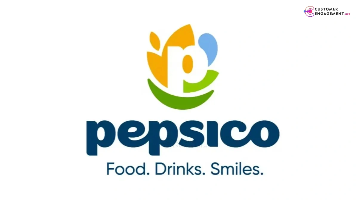
PepsiCo introduces a refreshed brand identity featuring a vibrant new logo, eco-inspired color palette, and smile motif, symbolizing its evolution towards consumer focus, sustainability, and innovation.
After nearly 25 years PepsiCo has redesigned their logo as part of their brand revitalization. A modern business brand should evolve to reflect contemporary aesthetics while also signaling business priorities to customers. PepsiCo’s new logo features the letter “P” and demonstrates values of consumer centricity, sustainability, and quality while the surrounding shapes signify connection and purpose.
The redesign’s new color schemes and fonts aim to demonstrate the brands roots in nature, highlight the environmental commitments of the brand and sign to the consumer. PepsiCo emphasizes their mission “Food. Drinks. Smiles” which displays their aim to promote a positive consumer experience and demonstrate this visually through the logo redesign.
The redesign demonstrates positive business priorities. The brand emphasizes happiness as the essence of their mission. The implementation of the redesign will commence in 2026. The redesign balances company priorities of innovation, growth, and sustainability while addressing visual business aesthetics.
PepsiCo demonstrates the positive impact of business redesigns. This logo redesign demonstrates to the consumer that business priorities reflect a new culture of connected purpose. Sustained purpose in visually modern business aesthetics motivates the consumer’s connection and reinforces consumer confidence in the company.
“Our new identity boldly reflects who we are in 2025: a company with expansive reach, aiming for positive impact across the globe and an unmatched family of beloved food and drink brands,” said PepsiCo Chairman and CEO Ramon Laguarta.
Discover more from Customer Engagement
Subscribe to get the latest posts sent to your email.


