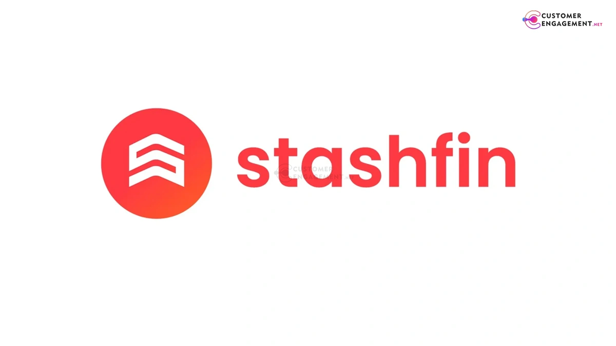
Stashfin unveils refreshed logo featuring ‘S’ as upward arrow in coral red gradient, symbolizing financial progress and empowerment for digital lending users across India.
Stashfin refreshes its brand identity with a sleek new logo, signaling evolution in India’s fintech lending space amid competitive growth.
Launched in December 2025, Stashfin’s updated logo features a minimalist “S” intertwined with a digital vault motif, shifting from its prior cluttered design to embody trust, speed, and innovation. The Kolkata-based lender, serving 10 million+ users, aims to strengthen recall in personal loans and credit lines, aligning with festive fintech surges.
Crafted by in-house creatives with agency input, the logo uses bold gradients of teal and gold for a premium feel, paired with a sans-serif wordmark for digital versatility. This refresh coincides with app UI overhauls, emphasizing seamless borrowing experiences amid RBI regulations. Early feedback highlights improved professionalism over legacy aesthetics.
Stashfin joins peers like Paytm in rebrands, betting on visual upgrades to boost user acquisition by 25% in 2026. As marketing specialists note, such pivots fuse nostalgia—like Swiggy’s Polaroids—with forward tech vibes, countering AI ad fatigue.